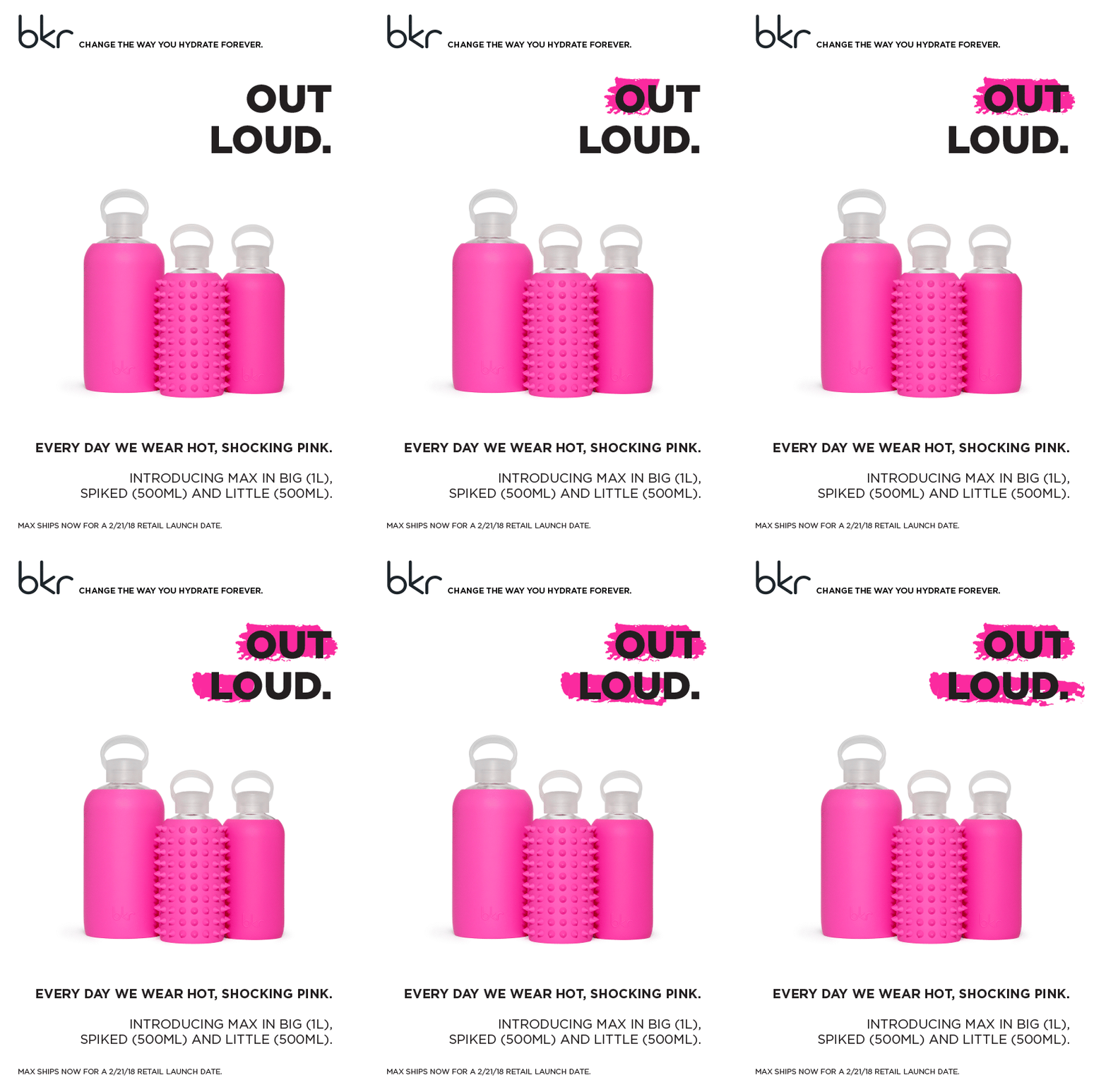
bkr
bkr had a strong, specific voice and approach to creative that really spoke to its community. And a new bkr release is usually the same glass water bottle in a new color, so the copy had to sell a feeling, not a feature. That meant moodboards, Pantone and WGSN references, and product-focused copy that came close to poetry. But the real unlock was time: emails and product descriptions were being written the day they went out. Getting a month ahead gave us room to go deeper on every color.


The Role
bkr makes beautiful, high-end glass water bottles, and it has a cult following in part for its voice. I oversaw copy and creative as the brand expanded into new markets.
The problem was baked into the product. Nobody needs a new water bottle, let alone the same one in a new shade. So every launch had to answer one question: why this color, and why now? The answer was never a feature. It was a personality.
The Feeling
Each color got a world of its own. We built moodboards, pulled from WGSN creative books and piles of Pantone swatches, and scoured the internet for the right references until every shade had a point of view. Then came the writing: run-on, reference-stuffed, closer to poetry than product copy.
The founder cared deeply about these descriptions, and there was a lot of back and forth to understand each other's reference points and meet in the middle. The payoff was range inside one voice. One color could be all zen and air:
Subject Line
Zen, ethereal & effortless: introducing Pepper
Another could be pure Manhattan excess:
Inspired by NYC in the summer when the temperature is in the 90s outside, but inside it’s 65 and the definition of luxury, a spring shopping paradise, marble, champagne, plush pink carpeting, Angel + Dren beats filling the room, trying on every cool kid brand, buying every other beautiful unnecessary necessity in a gilt-accented heaven, patiently waiting for the evening cooldown to take effect. I fell in love, his name is Fifth Avenue.
The System
For a while, none of this had room to breathe. Launch emails were being written the day they went out, which left so much less time for the stickier work.
So we changed how the work moved. A launch calendar put every message on the map weeks out. Briefs became conversations: talking through important events and references with the founder up front meant we knew what she was picturing before anyone wrote a word. And we started iterating earlier, so the creative bar could be set higher.
We went from writing same-day to working a month or more ahead. That time went straight back into the work: deeper references, more considered colors and fewer last-minute rewrites.
The Result
SEPHORA • LIBERTY LONDON • HOLT RENFREW
While I led copy, bkr launched at Sephora, Liberty London, and Holt Renfrew.
And bkr named a color after me!
bkr
Max
Named after me